Wednesday 30 December 2015

Final Adjustments: Double Page Feature


 I did not make many adjustments to my double page feature, however I did alter a couple to sentences in order to improve spelling and grammar. I feel that this page did not need a lot of adjustments made as there are not really any faults or areas of improvement.

Thursday 24 December 2015

Final Adjustements: Contents Page


I have also made adjustments to my contents page. At first, all the page numbers did not correspond with the features on the page so I had to change the numbers along side the photographs. I also removed 'Kanye West' from the feature column and replaced it with 'Carl Campbell' which links with the front cover. I also changed 'Band Index' to 'Band Reviews' as I feel this would appeal more to the audience. Finally I adjusted the features and photographs to look professional and made sure they were equally separated.

Tuesday 22 December 2015

Final Adjustments: Front Cover


 To ensure my magazine was of a high standard I made some slight changes to my pages. On the front cover, I changed the 'Artist of the Year' from Kanye West to Carl Campbell. This is because Kanye West does not really fit into the genre of my magazine, so instead I used another name which would not contradict the genre of the magazine. I also changed the size of the barcode in the bottom right corner as it appeared to be too big on the page.

Friday 18 December 2015

Production of Double Page Feature

I have designed and created a double page feature for my magazine. I have used typical conventions and my own photographs in which I have taken. I have also included an original article which I wrote myself for the double page feature.
 
 
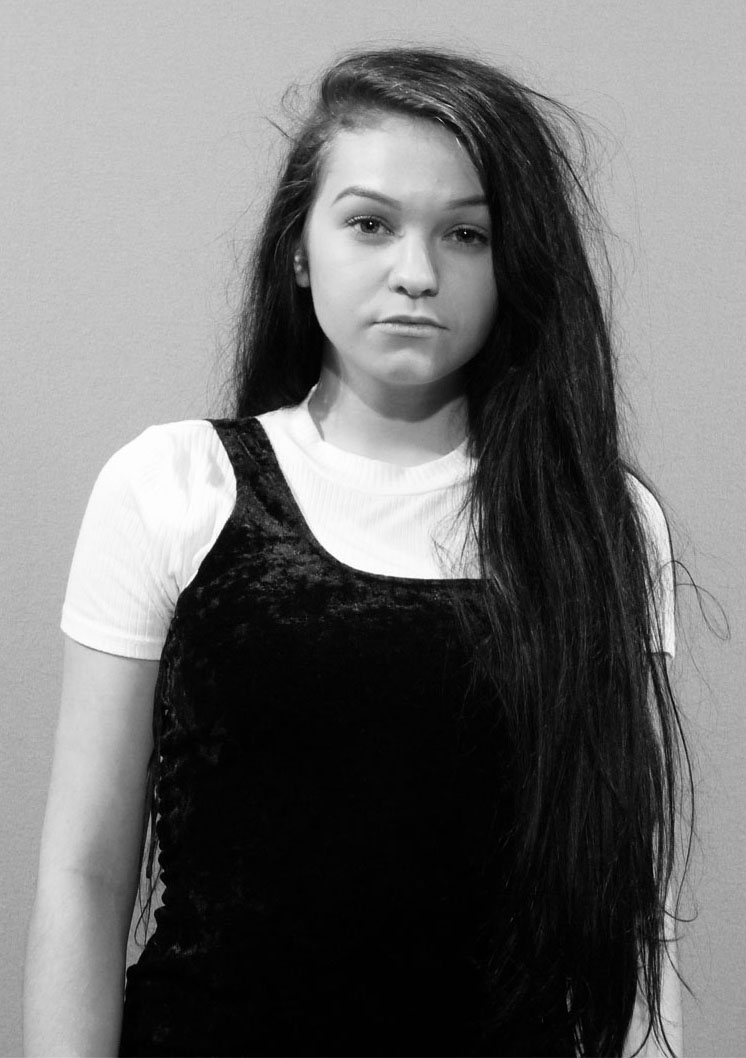
To begin with, I created a double page layout. On half of this page, I inserted my own photograph which I had edited using Photoshop. I used InDesign in order to produce my double page feature.
 
 
Secondly, I added a title at the top of the other half of the page. The title says 'Scarlett Riverwood' which is the name of the model posing in the photograph, adjacent to the title. The title is in a deep red/burgundy colour in order to match the picture and the theme of the magazine.
 
 
Next, I added in a long black rectangular box beneath the title. In this box is the tagline of the article, written in white writing. The reason I used this rectangle shape is so that the white writing can stand out against it. In addition to this, I added the photographers name beneath the tagline.
 
 
Then, I inserted my own original article, separated into three columns. This is a typical convention of a double page feature which makes my magazine more professional. I used a black and burgundy font in order to carry on with the theme portrayed on this page.
 
 
Finally, I added in a quote from the article positioned at the bottom of the image. I used this as it is another typical convention  of magazines. The font of the quote us quite messy/grungy which allows it to tie in with the theme of my magazine. The quote also uses two white rectangle shapes in order for certain writing to stand out. The quote is placed at the bottom of the image in order to avoid the writing overlapping the model's face.

Production of Contents Page

I have designed and produced a contents page for my magazine. I have taken my own photographs and featured them on my page. I have used a range of typical conventions for my contents page in order to make it look professional.
 
To begin with, I have inserted deep purple shapes in order to structure my contents page on. I also inserted a large banner of the same colour in order to highlight the white writing on top. This white writing is the magazine logo and the page title. This also sets the overall theme for this page which matches with the rock genre.
 
 
Next, I added in details such as article titles and page numbers alongside these. I also added small details such as the 'Features' title, 'Band Index' title and the issue number. These details are typical conventions of a contents page and informs the reader of what is included in this magazine.
 
 
Next I added even more detail to my contents page. For each article title I added in small details which gives the reader an indication of what the article is actually about and what it features. I have also added in writing for the box at the bottom left of the page which informs the reader of a chance of winning tickets. This relates to my target audience as my primary audience is aimed towards those who are into rock music. I have also added bands into the band index to inform the reader of which bands are included.
 
 
Afterwards, I added a range of photographs in which I have taken myself. I feel these photographs are of a high quality and match with the genre of my magazine perfectly. My target audience will enjoy these images and will inform them of what artists are included. This is another typical convention of music magazines.


Finally, I added smaller details such as extra page numbers for the images and small tweaks to ensure my contents page was of a high standard.

Tuesday 8 December 2015

Production of Front Cover


Over a period of time, I have designed and created a front cover for my magazine. I have used a range of typical conventions which would feature in  a magazine and taken my own photographs to use. I have taken screen captures of the production of my font cover.


To begin with, I opened up the photograph (which I had already edited) and fitted it with the measurements of the magazine front cover. This image denotes the model I will be using in my magazine.


                Here I have added my magazine's masthead. This also acts as a logo for my magazine. I chose this masthead design as it proved very popular in my questionnaire.


              Next I added basic white shapes so I can place article titles on top of them. These are to prevent the article writing blending in with the background as the colours may contrast.


I then added some typical conventions which include: Instagram, Twitter and Facebook logos. I also added a barcode and a price positioned at the bottom of the page.


Next I added in the article titles on top of the white shapes. This is so the writing stands out against the white. I also added the issue number at the top of the page.


  Then I added in a section of writing which includes a long list of bands featured in the magazine. I added this as it can draw in attention from readers as there are a lot of famous bands listed here.


 Finally, I added the main article title at the bottom of the page in order to inform the audience who the model in the image is.


Monday 7 December 2015

Front Cover Style Model


This is the style model for my front cover. I will use a layout similar to this in order to create a professional looking product. I will be using a female model on my front cover, in addition to the article titles running down the sides of the page. I will position the title in a similar section and use different fronts similar to these.

Double Page Feature Style Model

This is the style model for my double page feature. I will use on full half of the page for my double page feature image. I will use the other half of the page for the article, leaving a white background. I will use a large bold title above my article, in addition to a quote or writing on top of the image of my model.

Contents Page Style Model


This is the style model for my contents page. I will use a similar layout using the article titles and page numbers running down either side of the page in addition to the handful of images in the centre of the page. I will use a coloured banner at the top of the page with the title placed on top and issue number, similar to this.

Friday 27 November 2015

Editing of Contents Page Main Image

I have taken a variety of images to use for use for my magazines contents page. I used a green screen to take these photographs and I have selected one photograph to be the ain image for my contents page.


Beginning Image


1. I added a black and white effect on top of the image as this adds mystery to the photograph. I think this effect matches the theme of my magazine which is why I chose to do this.


2. Then I cropped the image to fit onto my contents page. I also darkened the image slightly to highlight the model's hair and costume. This makes her stand out even more on the page.

Tuesday 24 November 2015

Editing of Double Page Feature Image


I have selected a photograph to use for my double page feature. I took this photograph and edited it in Photoshop in order to make it look better.


Beginning Image


1. First I cropped the image in order for it to fit the measurements of the page. I will be using this image on half of the page do the model is a main focal point of the page.


2. Then I increased the brightness slightly and added an effect to make the photograph look more professionally edited. I also changed the colour of the wall as it was originally a green colour, however I have changed it to look like a grey stone wall.

Friday 20 November 2015

Editing of Front Cover Image

Beginning Image


1. I began by cropping the image in order to make it an appropriate size for my front cover.
 
 
2. Then I altered the image in order the make the model look her best. I blackened the roots of her hair and airbrushed her face slightly in order to look as presentable as possible.

This is my final Front Cover Image:


Friday 13 November 2015

My Chosen Images

These are the images I have chosen for my magazine:


Front Cover:


Double Page Feature:


Contents Page:


I have chosen each of these images due to the fact they are of a high quality and appear very professional. 

Tuesday 10 November 2015

Choosing the Main Image for my Contents Page

I took a variety of images for my contents page using a green screen and other settings as well as a variety of poses for my model. The majority of my photographs are very professional and I feel they would be great for my magazine, however some photographs are not the best to use.
 
 
1. This image is simplistic and high quality. I feel this image is very professional and could be a potential photograph for my contents page. The model is standing still, looking directly towards the camera which allows the audience to feel included. This is an appropriate image for a contents page due to the fact there is not too much going on to cause distraction from the rest of  the page.
 
 
2. I do not think this photograph is of a high standard. The lighting is very dim and does not favour the model. In addition to this, the model is not posing professionally, but instead being silly. The setting is not very clear on where exactly he model is which results in this image being inappropriate for my contents page. The image is also slightly blurred which brings down the quality of the photograph.
 
 
3. Personally, I think this photograph would be great for my contents page as it focuses on the model. The lighting is of a high standard and the quality of the image is great. The photo allows the audience to see the model's full outfit, however the background is quite boring and it is difficult to work out where the model is. This image could potentially be a good image to use for my contents page.
 
 
4. This photograph is clearly of a low standard. The lighting is extremely bright which causes the image to look unprofessional. The photo is very blurry which brings down the quality of the photograph. The model has obviously been caught off guard and denotes her posing in a silly way. I would not use this image for my contents page as it is not appropriate.
 

Friday 6 November 2015

Choosing Images for my Double Page Feature

I took a variety of images for my double page feature using different background settings and poses. The majority of my photographs are very professional and I feel they would be great for my magazine, however some photographs are not the best to use.
 
 
1. Personally, I do not think this photograph is good enough to use for my double page feature due to the fact the background takes up to much space and diverts attention away from the model which was not my intention. The model looks too small which does not make her appear independent or ambitious. I do not feel this would be an appropriate image for my double page feature as the positioning is not of a high standard. If the photograph was zoomed in slightly, then this could potentially be a good photo to use.
 

2. I quite like this image as not only does it denote the model as the main focal point, but it also denotes the autumnal scenery behind her. This photograph allows the audience to focus on the model as she is the main feature of my magazine. This medium close-up denotes the facial expression of the model and prevents distraction of background objects. I feel this could potentially be a good image for my double page feature.


3. This photograph does not look professional in my opinion. To begin with, the lighting is not of a high standard which does allow the audience to see the model very well. Even though the photograph is in focus, the positioning of the model is not great. The model's boots appear to be the focal point, which creates a distraction from the model herself. I feel if this photograph had better lighting and focused more on the model's facial features, it could be a potential image for my magazine. However I would not use this image for my double page feature.


4. I think this image is of an extremely high quality with very good lighting. I also think that the position of this model is very appropriate due to the fact she appears to be the main focal point of the photograph. The background scenery is very autumnal and the wall creates an 'edgy' look. I feel this high quality photograph would be fantastic for my double page feature as it looks very professional and focuses on the model.

Tuesday 3 November 2015

Choosing Images for my Front Cover

I took a variety of images for my magazine using different background settings. A lot of my photographs are very professional and I feel they would be great for my magazine, however some photographs are not the best to use.


1. In my opinion, I feel this photograph is of a very high quality. The photograph is not blurry or unfocused which allows the picture to look high quality. I like the way the model is posing and the background does not divert the attention away from her too much. The background denotes nature and a tree which makes the model seem adventurous. The costume chosen suits the magazine style so I feel this could be a very good photograph for my magazine cover.


2. This photograph is not as good to use for my magazine due to the fact it is not of a high quality and the position of the model does not look good. The branches in the foreground prevent the model from being the main focal point and cause her to become blurry. The background scenery also takes up a lot of the photograph which would not favour my magazine as I want the image to focus on the model. The photograph does not allow the audience to see her outfit very well, and it is difficult to see her facial expression. Overall, I do not think this photograph is of a good standard so I shall not use this as my front cover image.


3. This photograph comes across as very professional due to its high quality. The model is positioned in the centre of the image, yet the audience is still able to see the background scenery. The photograph denotes the model's outfit and her facial expression in high quality which is why this would be a good photograph to use for my magazine front cover. Again, this setting makes the model seem adventurous and down to earth.


4.  This photograph is clearly not very professional due to the fact the model is caught off guard and the image does not focus on the model. The model is more to the left of the image and only takes up a small section of the photograph. The background scenery takes up a lot of space in this photograph which diverts attention away from the model which is the opposite of what I wanted. This photo could be better if the model was placed more in the foreground and posing in a professional way. As a result, I would not use this as my front cover image.