Blog Archive
-
▼
2017
(20)
- ► April 2017 (8)
- ► March 2017 (3)
- ▼ February 2017 (5)
- ► January 2017 (1)
-
►
2016
(37)
- ► December 2016 (5)
- ► November 2016 (1)
- ► October 2016 (2)
- ► September 2016 (9)
- ► February 2016 (7)
- ► January 2016 (9)
-
►
2015
(39)
- ► December 2015 (9)
- ► November 2015 (7)
- ► October 2015 (11)
- ► September 2015 (12)
Tuesday, 28 February 2017
Sound Editing in My Film
The songs in which I have used for my trailer are the following:
The Conjuring [soundtrack] 04 'Witch Perch'
The Shallows Official Trailer Music
Colossal Trailer Music 'Paranormal Most Epic Hybrid Horror Music'
Colossal Trailer Music - Anomaly Most Epic Hybrid Horror Music
I also used the following sound effect from iMovie:
Thunder Roll (used twice)
Door Vault Closing
Dark Drone Suspense
I also created my own sound effect using the sound of branches snapping to create a sound effect in one my shots.
Friday, 17 February 2017
Film Magazine Front Cover: Research


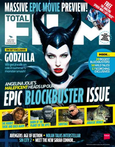
These are the four magazines I will be looking into in order to decide which one I would like to use for my film. I chose these as I liked the different layouts each magazine portrays, and how different some of them look.
Total Film is a UK-based film magazine which is published monthly and a summer issue is added every year, by Future Publishing.The magazine was launched in 1997 and offers cinema, DVD and Blu-ray news, reviews and features. Total Film is available as a print magazine, but also available to mobile devices to download.
Total Film tends to use action/thriller films on the front cover of their magazine, usually portraying the main character/characters. I feel my film would suit this magazine due to its genre.
Entertainment Weekly is an American magazine, published by Time Inc., that covers film, television, music, B theatre, books and pop culture. Entertainment Weekly targets a more general audience rather than a smaller more specific readers, broadening it's audience.
This magazine covers many different platforms of entertainment, especially TV series/shows. I feel this may be less suited for my magazine as my project is a horror film and may not be advertised as well in a magazine that has such a broad amount of content.
Empire is a British film magazine published monthly by Bauer Consumer Media. Bauer purchased Emap Consumer Media in early 2008. It is the biggest selling film magazine in the United Kingdom and is also published in the United States, Australia, Turkey, Russia, Italy and Portugal. Empire organises the annual Empire Awards and the awards are voted for by readers of the magazine.
Empire focuses on films, and mainly uses action/thriller films as their front covers. I think this magazine may be suitable for my horror film as the genre fits very well and I also really like the layouts that this film magazine uses.
Little White Lies is an internationally distributed movie magazine. It is published by London-based media company TCOLondon.
I like how unique this magazine is, and how it makes photographs into drawings. This magazine is very different, however I don't feel it would suit my magazine as it is a horror film, and this magazine rarely uses a horror film as its front cover.
Thursday, 16 February 2017
Editing Day 5
 |
| 4. A medium shot of the character in order to show the character moving from one place to another within the scene. |
 |
| 5. This shot is n over the shoulder shot in order to show what the character is doing. I cropped this frame in order keep the focus on the main character. |
 |
| 6. This is a medium close up of the character, as well as a tracking shot in order to follow what they are doing. |
 |
| 7. This is a point of view shot used in order to make the audience feel as if they are the character, looking down into the bathtub when the tap suddenly turns off. |
 |
| 8. A close up of the character's reaction of confusion. |
Wednesday, 15 February 2017
Editing Day 4
 |
| 2. This shot follows on from the previous shot. It is an over the shoulder shot which allows the trailer to denote the facial expression of Kate. |
 |
| 3. This is a medium shot of Kate which tilts up from down to up in order to reveal Carl's expression. This shot has been altered post-production in order to make the atmosphere gloomy and eerie. |
 |
| 5. This medium shot follows on from the previous shot, denoting Kate. This shot has also been altered to look less colourful and vibrant to fit with the horror genre. |
 |
| 6. This is a very long, point of view shot of Kate getting into a car. This P.O.V shot allows the audience to feel like they themselves are watching her and makes them feel part of the film. |
 |
| 8. This is a medium tracking shot of Kate, running through a corridor away from Carl. |
 |
| 10. This is a medium-long two shot of Carl being aggressive towards Kate. This shot is placed in a build-up sequence in order to create a crescendo. |
Subscribe to:
Comments (Atom)


