Over
a period of time, I have designed and created a front cover for my magazine. I
have used a range of typical conventions which would feature in a magazine and taken my own photographs to
use. I have taken screen captures of the production of my font cover.

To
begin with, I opened up the photograph (which I had already edited) and fitted
it with the measurements of the magazine front cover. This image denotes the
model I will be using in my magazine.

Here
I have added my magazine's masthead. This also acts as a logo for my magazine.
I chose this masthead design as it proved very popular in my questionnaire.

Next
I added basic white shapes so I can place article titles on top of them. These
are to prevent the article writing blending in with the background as the
colours may contrast.

I
then added some typical conventions which include: Instagram, Twitter and
Facebook logos. I also added a barcode and a price positioned at the bottom of
the page.

Next
I added in the article titles on top of the white shapes. This is so the
writing stands out against the white. I also added the issue number at the top
of the page.

Then
I added in a section of writing which includes a long list of bands featured in
the magazine. I added this as it can draw in attention from readers as there
are a lot of famous bands listed here.
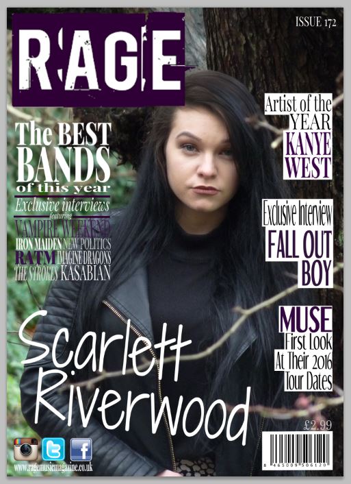
Finally,
I added the main article title at the bottom of the page in order to inform the
audience who the model in the image is.
No comments:
Post a Comment