Wednesday, 3 May 2017
Tuesday, 2 May 2017


Friday, 28 April 2017
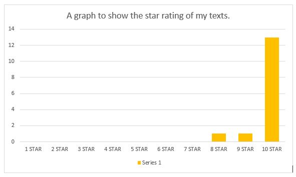
Audience Response Results Part 2
Below are some examples of answers written by my target audience for my survey.
Q5:
"It follows conventions because it follows how a horror trailer would be (builds up intensity and has a jump scare at the end)."
"The texts use colours that would be associated with horror films."
"There is lots of editing to make the trailer and other texts scary, like a horror film"
"The sounds and music fit with real life horror trailers"
Q6:
"I really like how the trailer gets really intense and builds up to a scary scene at the end."
"I like how image in the horror poster is similar to the image of the scary face in the trailer."
"The magazine cover looks real, the horror poster looks dramatic and the trailer has a really good story to it."
"I love the storyline, and the shots and editing is really good too."
"The editing is amazing, looks like real products."
Friday, 21 April 2017

Wednesday, 19 April 2017

Tuesday, 11 April 2017

Monday, 10 April 2017
Sunday, 9 April 2017
Saturday, 8 April 2017
Saturday, 4 March 2017
My Horror Poster - Audience Response
The following are quotes from peers who have viewed my horror poster and made comments.
Carl "I really like the colours used, I think it makes it look more like a horror theme,"
Nicole "The photo used is really creepy and the editing of it is really good, it looks like a really film poster for a film,"
Charley "The picture is scary, and I like the colours used. I like how the background is black too it makes it more horror-like,"
Thursday, 2 March 2017
Wednesday, 1 March 2017
Tuesday, 28 February 2017
Sound Editing in My Film
The songs in which I have used for my trailer are the following:
The Conjuring [soundtrack] 04 'Witch Perch'
The Shallows Official Trailer Music
Colossal Trailer Music 'Paranormal Most Epic Hybrid Horror Music'
Colossal Trailer Music - Anomaly Most Epic Hybrid Horror Music
I also used the following sound effect from iMovie:
Thunder Roll (used twice)
Door Vault Closing
Dark Drone Suspense
I also created my own sound effect using the sound of branches snapping to create a sound effect in one my shots.
Friday, 17 February 2017
Film Magazine Front Cover: Research
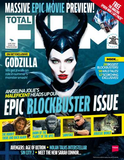


These are the four magazines I will be looking into in order to decide which one I would like to use for my film. I chose these as I liked the different layouts each magazine portrays, and how different some of them look.
Total Film is a UK-based film magazine which is published monthly and a summer issue is added every year, by Future Publishing.The magazine was launched in 1997 and offers cinema, DVD and Blu-ray news, reviews and features. Total Film is available as a print magazine, but also available to mobile devices to download.
Total Film tends to use action/thriller films on the front cover of their magazine, usually portraying the main character/characters. I feel my film would suit this magazine due to its genre.
Entertainment Weekly is an American magazine, published by Time Inc., that covers film, television, music, B theatre, books and pop culture. Entertainment Weekly targets a more general audience rather than a smaller more specific readers, broadening it's audience.
This magazine covers many different platforms of entertainment, especially TV series/shows. I feel this may be less suited for my magazine as my project is a horror film and may not be advertised as well in a magazine that has such a broad amount of content.
Empire is a British film magazine published monthly by Bauer Consumer Media. Bauer purchased Emap Consumer Media in early 2008. It is the biggest selling film magazine in the United Kingdom and is also published in the United States, Australia, Turkey, Russia, Italy and Portugal. Empire organises the annual Empire Awards and the awards are voted for by readers of the magazine.
Empire focuses on films, and mainly uses action/thriller films as their front covers. I think this magazine may be suitable for my horror film as the genre fits very well and I also really like the layouts that this film magazine uses.
Little White Lies is an internationally distributed movie magazine. It is published by London-based media company TCOLondon.
I like how unique this magazine is, and how it makes photographs into drawings. This magazine is very different, however I don't feel it would suit my magazine as it is a horror film, and this magazine rarely uses a horror film as its front cover.
Thursday, 16 February 2017
Editing Day 5
 |
| 1. This is the opening part the the final sequence of my film. It is a long shot of a door at the end of a corridor. I feel this gives the sense that someone is walking towards the door. I have used a Ken Burns effect on this shot. I darkened the shot and was he out the saturation in order to create a spooky atmosphere. |
 |
| 2. This is a low angle shot of the main character, walking towards the bathtub. The length of each shot is more and a few seconds long in order to build up tension and to drag out the silence. Again I washed out the colour and dimmed the lighting in this shot to create a darker atmosphere. |
 |
| 3. A close-up of the character's hand turning on the bathtub is used as I feel this adds to the eeriness of the scene. The quiet atmosphere adds a creepy tone, and the sound of only the tap running makes everything even more eerie. The saturation has been washed out as vibrancy would not suit this sort of genre. |
 |
| 4. A medium shot of the character in order to show the character moving from one place to another within the scene. |
 |
| 5. This shot is n over the shoulder shot in order to show what the character is doing. I cropped this frame in order keep the focus on the main character. |
 |
| 6. This is a medium close up of the character, as well as a tracking shot in order to follow what they are doing. |
 |
| 7. This is a point of view shot used in order to make the audience feel as if they are the character, looking down into the bathtub when the tap suddenly turns off. |
 |
| 8. A close up of the character's reaction of confusion. |
 |
| 9. This is a shot which pans from right to left to reveal the creature-like character. I have dimmed the lighting, washed out bright colours and lowered the saturation in order to create a horror-like atmosphere in all of these shots in order to create a spooky look. I feel this was a really good idea as it makes the scene even more scary. |
 |
| 10. This is a shot in which I edited in photoshop in order to manipulate the character. I used a series of tools in order to achieve this creepy look to make the character look more creature-like. I feel this really adds to the horror genre. |
Wednesday, 15 February 2017
Editing Day 4
 |
| 1. This is an over the shoulder shot of the two main characters (Kate and Carl) talking in their new home. This shot allows the plot of the film to progress through dialogue and also denotes the expression of Carl. |
 |
| 2. This shot follows on from the previous shot. It is an over the shoulder shot which allows the trailer to denote the facial expression of Kate. |
 |
| 3. This is a medium shot of Kate which tilts up from down to up in order to reveal Carl's expression. This shot has been altered post-production in order to make the atmosphere gloomy and eerie. |
 |
| 4. This is a medium close-up of Carl, which tilts upwards in order to reveal his facial expression. This shot has been adjusted to look left colourful and vibrant in order to make it fit in with the horror genre. |
 |
| 5. This medium shot follows on from the previous shot, denoting Kate. This shot has also been altered to look less colourful and vibrant to fit with the horror genre. |
 |
| 6. This is a very long, point of view shot of Kate getting into a car. This P.O.V shot allows the audience to feel like they themselves are watching her and makes them feel part of the film. |
 |
| 7. This shot follows on from the previous shot, denoting a medium close-up of Carl, watching Kate. I like this shot as it shows there is sunlight outside, yet he is masked by the shadow which gives connotations of evil and mystery. |
 |
| 8. This is a medium tracking shot of Kate, running through a corridor away from Carl. |
 |
| 9. This shot follows on from the previous shot which denotes Carl running after Kate. These two shots have been altered to look dark, dull and colourless in order to fit with the horror genre. The shot is also a low angle shot in order to make Carl look powerful and dominant in this situation. This is a typical convention of a horror; making the villain appear bigger and stronger through low angle shots as it appears they are looking down on everyone else. |
 |
| 10. This is a medium-long two shot of Carl being aggressive towards Kate. This shot is placed in a build-up sequence in order to create a crescendo. |
 |
| 11. This is a close-up, over the shoulder shot of Kate hiding under a table, denoting what appears to be Carl's feet walking infant of her. This puts the audience on edge and builds tension as to whether Carl will find her or not, but this is not revealed as this is just a trailer. |
 |
| 12. This a a long shot of Carl storming towards the camera with a knife to look scary and intimidating. This shot, like many of the others, has been altered to look dull and gloomy to fit with the typical conventions of the horror genre. |
Monday, 2 January 2017
Editing Day 3
 |
| 1. This is a tracking shot used towards the beginning of the horror trailer. I used this shot to denote the main character asleep, dreaming. I will be editing in short, sharp clips of another character, running from someone/something in order to progress the plot of the film. It also gives the effect that someone/something is watching her sleep. |
 |
| 2. This medium close-up shot follows the previous shot; it denotes the character waking up from her dream in terror/shock, this suggests it was more a nightmare than a dream. Within these two shots, I made the lighting darker in order to make the shot look like it was shot at night. I also added a blue tint to the shot in order to enhance the night-time look. |
 |
| 3. This shot is the opening shot of a different sequence. It is a long shot of the main character sitting in the living room using a device. This shot establishes where the character is (at home). |
 |
| 4. The trailer cuts to an over the shoulder shot of the main character reading what appears to be a news article. I altered the lighting in order to make the article stand out against everything else in the shot. |
 |
| 5. This is a low angle shot of the main character which denotes her expression towards the article. I used this as it allows the audience to understand the emotion behind the character. |
 |
| 6. This is a super-impose shot. I used this in order to show the main title of the article, to keep the audience updated with the storyline but to also to show the expression of the main character. This is a panning shot onto of a low angle shot. |
 |
| 7. This is a very long shot of the character, but from a different angle from the opening shot. In this shot, the music builds up to a sudden stop, and the character looks up from the article after hearing a loud noise. I used this shot as it denotes the character looking up, across the room, suggesting there is something sinister happening. |
 |
| 8. The shot then cuts to a medium close-up of the character in order to denote her confused expression towards the mysterious noise. Each of these shots within this sequence have been altered in iMovie, in order to make the shots look darker and less saturated/colourful. This is to give a sinister feel to the trailer in order to fit in with the genre. |
 |
| 9. This is the opening shot of another sequence. This is a medium long shot of the character searching through a bedroom. This sequence carries on the storyline of the trailer, where the girl finds a necklace for another girl from her husband. |
 |
| 10. This is a close-up of the characters hand, denoting her discovery of a small box. I used this shot in order to make it clear to the audience of what the storyline is. |
 |
| 11. This is a low angle, medium close-up which allows the shot to show the facial expression of the character when she discovers the mysterious box. |
 |
| 12. This is an over the shoulder shot to denote the character opening the box, and looking at a necklace and a note which reads the words 'To, Megan x'. I used this shot so the audience can see what the main character is looking at, as if they themselves are looking into this box. |
 |
| 13. I used a jump cut into a close up of the note to make it clearer for the audience and to add a dramatic effect. |
 |
| 14. In the final shot of this sequence, I used a low angle close-up of the character in order to denote her confused facial expression, connoting that there is something wrong. In this sequence, I have again altered the lighting, saturation and colour in order to make the frames more eerie in order to fit into the horror genre. |
 |
| 15. This is a close-up shot used towards the end of my trailer which denotes the main character calling for help. I took a lot of the bright colours out of this shot and washed them out to create an eerie feel to the frame. |
 |
| 16. This is a shot point of view shot of a door. In this shot, the door slowly closes shut by a supernatural force. I changed the lighting and colour to make this shot appear at late evening. |
 |
| 17. This medium shot follows on form the previous shot in order to denote the expression of the character towards the mysteriously closing door. |
 |
| 18. This is another medium-long shot of the main character used towards the end of my trailer. The lighting and colour again makes it appear at evening time and fits in with the horror genre. |
 |
| 19. This is a medium tracking shot which tracks the main character as she runs from something. This shot has also been altered to appear eerie and to look as if it was shot in the evening time. |
 |
| 20. This medium close-up of a door slam follows on from the previous shot in order to add effect. I have, again, altered the lighting, saturation and colour to make the atmosphere very sinister. |
Subscribe to:
Comments (Atom)